IFAs understandably expect a lot from financial logos. After all, it serves as the visual focal point for your brand, so it should look prestigious, credible and original at the very least.
Hitting these criteria for a financial logo design is difficult, if you go the cheap route. Plenty of “auction-style” websites exist to cater to IFAs who want this kind of solution.
However, you’re only really going to hit the mark by working with a reputable logo designer, particularly one who specialises in financial services. Your logo will be with you a long time, so surely it’s worth the extra investment to get it right?
A financial logo needs to be simple as well as high-quality, as well as conveying the ethos and values of the financial brand in question. It needs to be memorable and timeless, yet also modern and in-line with contemporary design trends in order to appear fresh and current.
This is asking a lot out of one symbol! Any financial logo designer will tell you it takes time to craft something compelling like this, which ticks all the relevant boxes described above.
Yet this is the kind of work we thrive on, and deeply enjoy. Having done hundreds of financial logos now over the years, we feel we have a pretty good sense of what the design trends are likely to be in 2018. We’d like to share some of those with you here.
#1 Simplification of Form
Source: http://1000logos.net/juventus-logo/
Take a look at the Juventus logos above. The most recent design in 2017 differs markedly from the previous years’ designs, in that it is much simpler. Financial logo design is likely to follow a similar trend in 2018, as logos strip down to the basics and aim for minimalism and simplicity.
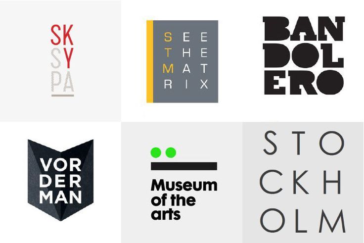
#2 Using Basic shapes
![]()
![]()
Source: https://www.underconsideration.com/
A design trend that was widely seen in 2017, use of a legible font coupled with basic shapes (circles, squares and lines) is likely to persist into 2018.
#3 Stacking Letters
Source: Pinterest
If your financial firm has quite a long name, then one logo design trend that may work for you is to place the words on top of one another. This makes longer business names easier to digest, more quickly. Using different colours to contrast the words also helps in attracting the eye, and holding attention.
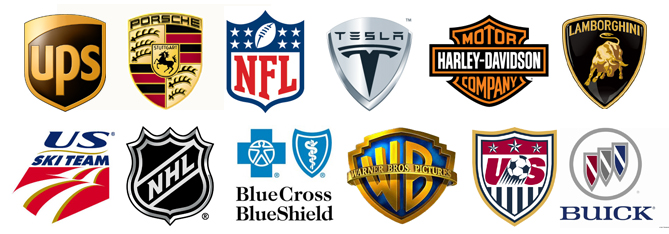
#4 Coat of Arms
Source: Change Conversations
Tried and tested over many years now (as shown above), coat-of-arms are a great way for financial logos to convey a sense of heritage, tradition and established financial practice and expertise. If you’re gong for a more “retro” vibe in your branding as well, then this can be a strong route to go.
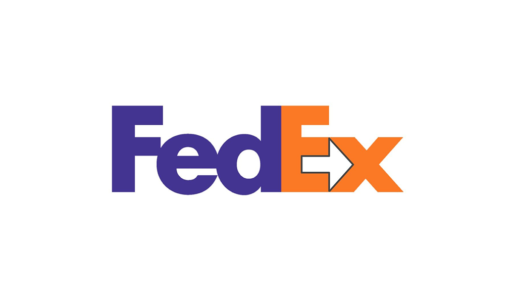
#5 Use of Negative Space
Source: Just Creative
Similar to the previous, this approach to financial logo design is not new – and the trend is set to persist into this year. Highly- effective works of art can be accomplished by embedding subtle, or hidden, shapes within or between the lettering of a logo.