The Internet is one of the fastest growing marketplaces in the world and as a greater number of people have access to the online arena, a website’s appearance and functionality is more important than ever before. These are actually two different areas to address, so we should first examine the main visual features that an effective website needs to possess to provide the visitor with the most pleasant experience as possible.
Less is More
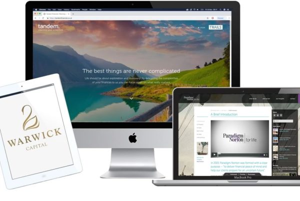
One of the primary aspects that a financial website needs to address is clutter. There are countless platforms that appear as if they are trying to accomplish too many things at once on their landing page. This can be fatal to attracting business, for this first page will absolutely determine whether a visitor will be interested. So, it is all but essential to keep the clutter to a minimum. As individuals read left to right, a navigation bar should be located on the left-hand side of the page. All links should be clear and easy to read. The page should not offer too many flashy colours and the font of the text needs to be easy to read. This will enable visitors to find what they are looking for and progress to other areas of the site where they can be actively engaged.
Billboards Not Allowed
Banner advertisements smack of a cheaply designed site. Taking this concept a step further, they can actually be quite annoying to those who are looking for sound financial advice. While affiliate advertising is an excellent way to increase revenue and ROI, they have no place on a financial website. The only instance where this may be acceptable is if they are linked to relevant and reputable financial portals that are easily recognised.
Throw Away the Stock Photos
It is quite funny to witness how many financial sites still insist on using the picture of a photogenic man or woman happily answering a hands-free phone in an office environment. Although sites may have been able to get away with such frivolities a few years ago, those days are over. Visitors need to see real people who represent the company. Stock photos will lend a notion of poor design, questionable quality and a randomness that does not embrace interpersonal relationships.
Testimonials
Objective reviews from real customers are excellent ways to help convince a prospective client of the veracity of one’s financial services. These should not be hidden on some obscure page, but instead they need to be one of the first things that a visitor will encounter. So, a landing page is a perfect location for these rock-solid testaments. A visitor’s doubts will be allayed and he or she will be much more likely to enquire as to what other services the site provides.
Keep all of these tips in mind when designing a financial website. The end results can be an increased hit rate, a loyal customer base and a higher revenue yield.