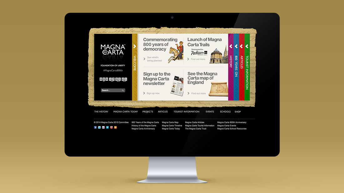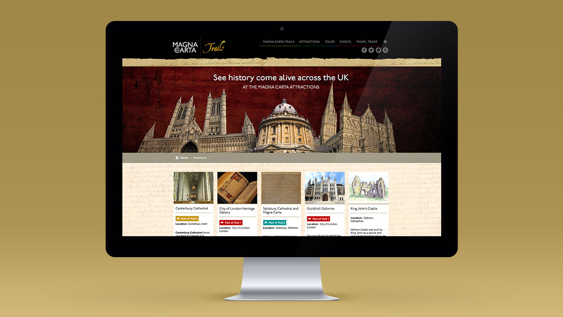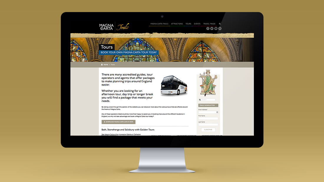
The results
800 years of liberty.
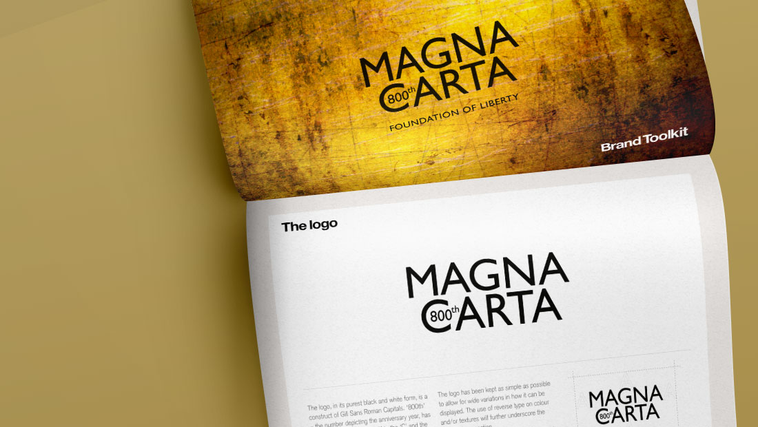
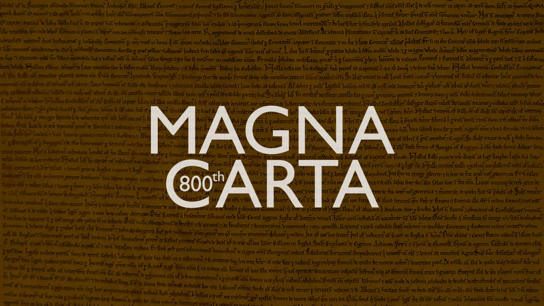
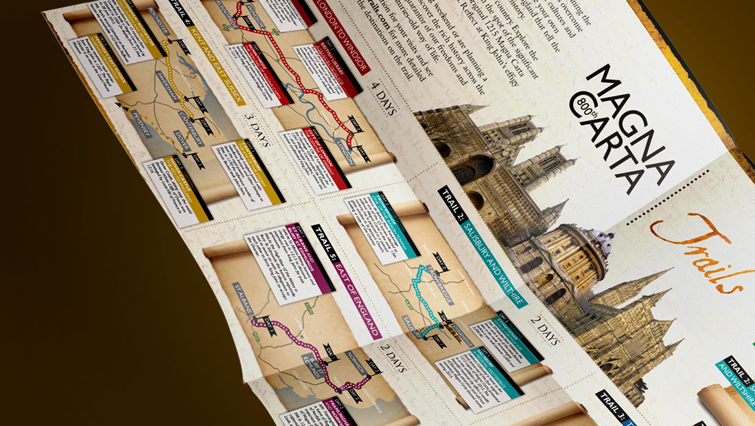
The comprehensive branding solution for Magna Carta featured powerful, clean lines which connect clearly to the modern world; whilst retaining distinct, medieval associations.
The logo deliberately followed a minimalist approach; giving it enhanced flexibility to adopt wide variations across different formats and platforms. The medieval connotations were also further underwritten though the use of reverse type and varied colours on various background textures.